Telling-Stories-with-Data
| home page | data viz examples | critique by design | final project I | final project II | final project III |
Data Critique and Redesign: Global pet ownership data
Step one: the visualization
After looking through the different data sets and articles on the Makeover Monday website, I decided to go with one that had a topic that peaked my interest- pets. This was the original data visualization.
Source: “Man’s best friend: global pet ownership and feeding trends.” Makeover Monday. April 14, 2025. https://data.world/makeovermonday/2025-week-14-pet-ownership
Step two: the critique
There were many things that I liked about this visualization:
- I liked the use of use of color- and the pallette- as well as the use of images/graphics to represent the dog, cat, fish, and bird categories.
- I liked the use of gray
- I liked how the lines connected the country names to the stats and provided a line for the stats to sit on- a nice visual line
- I liked that this was not a typical visualization- it was kinda fun!
At the same time, there were many things that were not working for this visualization:
- The countries and their lines did not connect to the geographic location on the globe graphic
- the overwhelming amount of numbers, which did not lend themselves to comparing country’s stats
- the countries were organized alphabetically, rather than highlighting a trend or outlier
- there was no storry being told
- The title and subtitle were not clear and I was left confused as to what these numbers actually represented- what did ‘percentage of people’ mean- individuals, households, did it include people who own multiple types of pets?
Additionally, it was not initially clear who this data visualization was for. I clicked on it because I love dogs, but this information is not super useful to me. I had to spend time thinking who this would be helpful for- as the “article” that this graphic was in really didn’t give any clues to this and was very unorganized.
I figured that organization or companies in the pet industry could find this useful- like pet food/supplies stores or animal service organizations like the SPCA. Or, if someone was considering moving to another country, this would give them insight into what kinds of pets are common to own there. Still, it is a niche audience.
After reading Stephen Few’s model on Data Visualization Effectiveness Profile and learning about the 7 different categories that we can use to evaluate the overall effectiveness of a visualization, I realized that the original graphic wasn’t really that usefull or engaging. Though the graphic was aesthetically ok and generally intuitive, it didn’t do much to help audience members interpret the data or give it any meaning. There was no story.
Step three: Sketch a solution
I first started by writing out what I though the original graphic was trying to accomplish- comparison of countries and comparison of pets within countries. I also realized that this data was more declarative than it was exploratory, and more data driven than conceptual- which led me to categorize this data visualization as an ‘Everyday Data Viz’, as referenced in the Good Charts textbook.
I then moved into a few simple sketch ideas. My instinct was to do a bar chart, as this would allow the audience to make quick comparisons.
I realized that drawing each of these by hand was not going to lead to the precision I wanted, especially with a stacked bar chart visualization model- so I turned to Tableau.

There were things that I ideally would fix on Tableau but wasn’t sure how to do yet, including changing the vertical country names to be slanted and moving the x axis lable to the bottom of the graph.
Step four: Test the solution
When getting feedback from my peers, I decided not to prompt them with any questions at first, but simply show them the data visualization. My intention here was to make sure that my graphic could speak for itself. If questions naturally came up, I would immediately see which aspects could be improved.
Once I recieved feedback (listed below in the table) I asked more specific questions, like:
1) Is the title clear? 2) Does the subtitle help to add context? 3) Would it be helpful to put an example of how to interpret the graphic in the comments at the bottom? Or does this mean that the graphic cannot speak for itself? 4) Do the percentages confuse you? 5) Are the axises clear? Should I switch them.
Peer feedback:
| Interviewee | Feedback 1 | Feedback 2 | |
|---|---|---|---|
| Student 1 | The vertical position of the country names made it difficult to read, is it possible to put them at a slant? | I had to think twice about whether the title meant people or households, but the subtitle helped | |
| Student 2 | Because the data adds up to over 100% and the data isn’t showing how many people in each country own a pet, but specific pets, what if you separated the pet categories to be side by side? | Could switching the columns and rows help to be able to read the countries better? | Is there a reason you chose to organize your data this way?- showing dogs? |
| Student 3 | It is difficult to differentiate between the shade of blue and green- increased contrast would help | is you separate the pet categories, it is easier to see the differences in the colors |
Synthesis:
Based on this feedback from my peers, I understood that my visualization was clean and aligned with the story I wanted to tell, but, the stacked bar chart wasn’t necessarily the best way to help the audience interpret the data (for the following reasons): 1) the data wasn’t about the percentage of people who own a pet in each country, but the percentage of people who owned specific types of pets 2) the aggregate data added up to over 100%, which was confusing and didn’t aid in the helping to tell the story of how many people own specific types of pets 3) there was the possibility for overlap between pet categories- people could own multiple types of pets 4) the stacked bar graph leads you to look for the country that owns the most pets, which is not what the data represents
All of the interviewees agreed that a version of a side by side bar chart might work better- so I tried that!
I also realized in the process of embedding my tableau visualizations to this site, that I needed to adjust my tableau setting to have the visualization fit the entire page- a setting I would need to adjust for my next version.
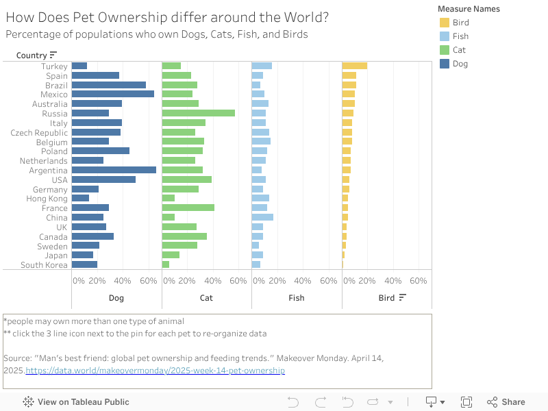
Step five: build the solution
I started to my redesign focusing on separating the stack bars into each of the different pets. I play around with switching the columns and rows, but ultimately decided on having country names as the rows so that it was easy to read, and columns as percentage of people who own each pet- sorted into 4 categories- 1 for each pet.
I decided to order the pet categories from left to right based on the highest percentages, so dog, then cat. Fish and bird were fairly even, so I kept the order from the original graphic: fish, then bird.
I also made sure to edit the percentage ranges in the y axis to be consistent for each pet. The default was to scale each percentage range differently for each pet. For example: dog when from 20% to 60%, where as fish when from 0% to 40% or so. This inconsistancy made it seem that there were just as many fish owned as dogs, which is not correct- we want to present data in a truthfull way.
I then discovered that I could sort the data by high to low or low to high percentages for each pet- which rearranged the order of the countries. I made sure to put a note of this in the caption at the bottom so audience members know they can manipulate the data and interact with it based on what they are interested in.
Lastly, I decided to change the colors back to what they were in the original design. I felt that this color pallette was more calming and cohesive. The contrast of the colors in the 1st redesign was helpful since the data was so close together, but now that the pet categories were separated it felt ok to return to the original color pallette.
Here is my final redesign:
References
Berinato, Scott. “Good Charts: the HBR Guide to Making Smarter, More Persuasive Data Visualizations.” Harvard Business Review Press. 2023.
Few, Stephen. “Data Visualization Effectiveness Profile.” Visual Business Intelligence Newsletter. January-March 2017. https://www.perceptualedge.com/articles/visual_business_intelligence/data_visualization_effectiveness_profile.pdf
“Man’s best friend: global pet ownership and feeding trends.” Makeover Monday. April 14, 2025. https://data.world/makeovermonday/2025-week-14-pet-ownership