Telling-Stories-with-Data
| home page | data viz examples | critique by design | final project I | final project II | final project III |
Wireframes / storyboards
Link to Shorthand: [https://preview.shorthand.com/OmrFH7vRAVEpA5C0]
User research
In order to refine my story, I took into account who my audience is and the questions I plan to ask them in order to improve the clarity and impact.
Target audience
My target audience is:
- graduate students, and therefore likely high achieving, highly motivated, and prone to stress
- between the ages of 20-35
- all gender expressions and identities
- enjoys listening to music of all genres and for a variety of reasons
- receptive to resources for improving mental health
Interview script
| Goal | Questions to Ask |
|---|---|
| Clear Story | Can you summarize the main points of the story? |
| Audience connects with story- emotional response | Did you identify with any of the statements or statistics? |
| Impactful Graphics | Would the story have been the same without the data visualizations? |
| Clean graphics | Walk me through your thoughts when you first looked at the data visualizations? Were they overwhelming? |
| Clear graphics | Can you explain to me what each graphic represents? |
| Clear call to action | What was your main take away from what you saw? |
After walking my interviewees through my story and data visualizations, I will use the following script:
1) Can you summarize the main points of the story?
2) Did you feel connected to, or see yourself in any of the statistics?
3) What would the story be like without the data visualizations
4) What if I had only shown you the data visualizations?
5) looking at a dataviz Walk me through your thoughts when looking at this data visualization? What are your feelings? Do you feel overwhelmed, confused, clarity, excited, sad?
6) looking at a dataviz What does this graphic represent or mean to you?
7) looking at a dataviz Is there anything that would make this graphic more clear?
8) What was your main take away from this story? Was there anything unclear or left unsaid?
Interview findings
I received a ton of unstructured feedback during my “presentation” to my interviewees. When I came to each data visualization, they had super quick bites of feedback- so we speant a majority of our time giving and getting feedback in this way, rather than the more structured interview questions I had planned- which was totally fine- in fact, it was probably more helpful because they found things that I hadn’t thought to ask questions on!
A few takeaways from the unstructured feedback included:
-
changing the color of my name from white to a darker color and the spacing/centering of the content on shorthord
-
using a different graphic for this:
- using a different title and lables for this graphic:
- adding more visuals/pictures to help break up the text and make it more visually interesting
After walking through the shorthard and data visualizations I made, I went back and asked some of my initially planned questions:
| Questions | Interviewee A | Interviewee B | Interviewee C |
|---|---|---|---|
| Can you summarize the main points of the story/the main takeaways? | Yes- absolutley! It was super clear and I followed easily | It wasn’t overly complicated, but it was clear and too the point. | I really should go listen to some music! |
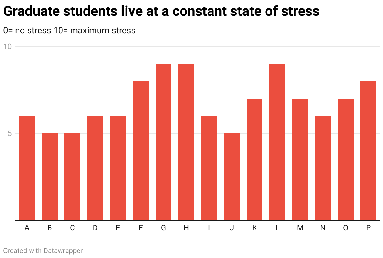
| Did you feel connected or see yourself in any of the data or stats? | Yes. As a grad student, absolutely. | Yes! | Oh yes, especially with the numbers identifying levels of stress. I know what it feels like to be at an 8 versus a 4. |
| Would the story have felt the same without the data visualizations? | Oh no! There would have been far to much text. The large numbers you have are good, but might have gotten lost in the text too. | I agree, it would have been far too much text, especially since you don’t have any other normal pictures right now. | The visuals really made the story understandable immediately. |
| If I had only shown you data visualizations, would you have understood the story? | Yes, absolutely. | Yes! It was clear and to the point. Your visuals were very clean. | Your visuals were super strong! I really liked them, especially the dot type plot with the arrows. |
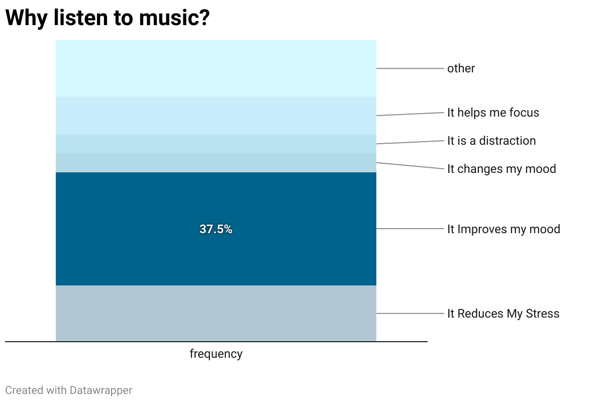
| Take me through your thought process for this visualization (referring to the blue stacked bar chart ‘Why Listen to Music’ which can be seen above) | I don’t understand why the percentages are in this order. Maybe images/ or emojis could be added to a different type of graphic could help the audience understand? | The horizontal spread of the stacked bar chart was confusing to me- was there a specific reason- or was that just the default. Also the info and data doesn’t really lend itself to that graphic, maybe a different type of chart or visual would work better? | The title was misleading because didn’t explain that these ‘reasons for listening to music’ were the subject’s number one reason. So maybe showing a bar chart rather than a stacked bar chart might be better? And refining the title of this! |
These questions were a good way to summarize our feedback/interview session, but really, the initial presentation and walk through is where I got the most valuable feedback: my story is good and impactful, the overall design choices are good, but a few data visualizations needed revision to better aid my story- the type of chart themselves as well as a few titles.
Identified changes for Part III
| Research synthesis | Anticipated changes for Part III |
|---|---|
| My titles need to be more clear and contribute to my story, not just state what the data is showing. | I will change my graphic title for ‘Reasons People Listen to Music’ to represent that these ‘reasons’ were people’s number one/main motivator for listening to music. |
| A few of my graphics are not the best type for representing my data. | Use additional graphic design resources besides Tableau or Datawrapper to create visuals that are more simple and help tell the story, rather than just presenting the data I found. Experiment with different types of graphics for the ‘Reasons People Listen to Music’ visualization. |
| Labels and axes could be more clear/present/bold. | Edit axes to include more context, keys, bold format, etc. |
| There’s alot of blank space and text. | Add in more visuals/pictures in addition to my visualization, but not too many, because I want the presentation to be clean and calm |
Overall, these interviews provided me with extremely valuable feedback that I feel I will be able to implement quickly and easily. From what I could tell, my story is strong and my audience members will connect with it; there’s just a few tweaks I need to make to my data visualizations, as well as more information/text to add to connect those visualizations.
I feel much better about my progress after these interviews than I did going into them- which is always nice.
Moodboards / personas
Though I didn’t do a formal moodboard, when starting to design my shorthand, I knew that I wanted a clean, simple, calm design because my whole story is about using music to reduce stress levels.
So I immediatley edited out the bright purple and yellow from the original design to be a calm, cool tone blue with dark gray and black text. I centered most of the content to keep eye travel to a minimum. I also prioritized using neutral colors for my visualization (other than a few alert colors that I felt would stand out and catch the auidences’ attention). I was very purposeful in paring down the ‘bright and shiny’ elements in shorthand to keep things simple and clear.
References
Chi, T., Cheng, L., & Zhang, Z. “Global prevalence and trend of anxiety among graduate students: A systematic review and meta-analysis.” Brain and Behavior, 13, No.4 e2909. (2023) (https://doi.org/10.1002/brb3.2909)
Lonsdale, A.J. and North, A.C. “Why do we listen to music? A uses and gratifications analysis.” British Journal of Psychology, 102: 108-134. (2011). (https://doi.org/10.1348/000712610X506831)
Thoma, M. V., La Marca, R., Brönnimann, R., Finkel, L., Ehlert, U., & Nater, U. M. “The effect of music on the human stress response.” PloS one, 8(8), e70156. (2013) (https://doi.org/10.1371/journal.pone.0070156)
American Music Therapy Association. “What is Music Therapy?” About. 2005. (https://www.musictherapy.org/about/musictherapy/)
T Zaatar, M., Alhakim, K., Enayeh, M., & Tamer, R. “The transformative power of music: Insights into neuroplasticity, health, and disease.” Brain, Behavior, & Immunity - Health, 35, 100716. (2023). (https://doi.org/10.1016/j.bbih.2023.100716)
Resources
- Shorthand
- Datawrapper
- Google Surveys/Quiz
- Excel
- Canva